My dedicated hoopers—welcome to a new decade of basketball! One of my New Year’s resolutions is to become far more active on this blog, striving for a monthly blog post. A major reason why I have been so sluggish on the blog has been due to me attending grad school to pursue an M.B.A. One of the many things that I have learned in school has been how marketers utilize conjoint analysis, a statistical tool that allows marketers to understand how consumers rank specific features in products. Because Oklahoma City is unveiling their new Memorial Bombing City Edition this week—if you haven’t seen this absolute beautiful jersey, it’s shown as the header pic—against the Houston Rockets (1/9), I figured this would be a fitting time to explain how Nike could use more customer-centric tools like a conjoint analysis to design their yearly new City Edition jerseys. To preface, I don’t claim to understand how Nike currently designs their jerseys, so I write this not as a criticism against Nike but rather to show how a conjoint analysis could be applied in regard to jersey designs.
There are many advanced conjoint analysis software as it depends on some rigorous multi-variable regression analysis. For the purpose of this post, I will look into 5 different features and at most 3 different attributes within those features. To further clarify, I looked into decorating the next Oklahoma City City Edition jersey. The features and attributes that I examined are as such:
| Predominant Color | Main Art | Number of Colors | Font | Number Placement | |
| Attribute 1: | Primary
(i.e. Blue) |
Mascot
(i.e. Rumble) |
1 | Serif | Large and Center |
| Attribute 2: | Secondary
(i.e. Orange) |
Landmark
(i.e. Skydance Bridge) |
2 | Sans Serif | Smaller and Non-Center |
| Attribute 3: | New | None | 3 |
After the designer brainstorms the features and attributes that he or she wants to examine, the designer creates different concepts that are different permutations (or combinations) of the different features and attributes. Email me for a mock survey for reference (KangJ20@darden.virginia.edu). These surveys are then sent out to a target audience. The target audience that I chose were 15 friends that all watch the NBA—a large majority of the 15 being Oklahoma City Thunder fans. It’s crucial for Nike or designers to understand who their target audience is.
After the designer receives the survey results, the designer can create a regression analysis as shown below.

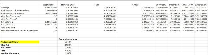
Interpreting the Regression Results:
Coefficients correlate directly to utility levels—essentially, the higher the coefficient, the more that the surveyed consumer prefers that feature and attribute. For instance, we see that the largest coefficient (10.33) correlates to “Predominant Color—New” which means that this specific consumer would really like to see the next jersey feature a new color other than the team’s primary and/or secondary colors. The designer will also notice that a “Predominant Color—Primary” seems to be missing from the regression results. That result is actually the inverse of the summation of the other “Predominant Colors” results. So here, “Predominant Color—Primary” is -13 (10.33 + 2.67). This means that the surveyed consumer would absolutely hate to see a primary color become the predominant color for the next jersey. We could do this for all of the other features and attributes that aren’t explicitly shown in the regression results.
The designer can also calculate the feature importance. I won’t get into the details of how to calculate each features’ importance to the consumer (if interested, go here: https://www.questionpro.com/help/conjoint-analysis-attribute-importance.html). However, here we can see that of the 5 features, this particular consumer heavily cares about predominant color (~52%) and then main art (~35%). Furthermore, we can note that the number of colors is a negligible feature for this consumer (~2%).
Aggregating the Results:
I mentioned that I surveyed 15 consumers. In reality, we would want far more as 30 is typically the magic number for a regression analysis to be valid. That said, I was able to aggregate the results for those surveyed. Here’s what I found:

Most consumers in this target demographic rank predominant color as the utmost important feature in a jersey. Then, the consumer ranks the main art that the jersey displays as the second most important feature. Of those surveyed, 46% preferred the predominant color to be the team’s primary color, and 53% would like to see the mascot displayed as the main art of the team’s city edition jersey.
How does this help?
This post is mostly aimed for people who are in the business of design. These conjoint results will help guide the designer to understand where he or she needs to fixate most of their efforts on. Furthermore, it further demonstrates to the designer what attributes consumers prefer in regard to each feature.
Quick aside & learning lesson: the designer ought to have rough sketches that display these difference concepts for those that are surveyed to better visualize the concepts. Not having these visual representations made the survey much more difficult for my sample audience.
Nike has done a great job these past couple of years in unveiling their new jerseys. They can further supplement their customer-centric design efforts by tools like a conjoint analysis.
That said, let’s enjoy the debut of the Oklahoma City Memorial City Edition jerseys next Thursday! Glad to be back!

Dear baseline jam,
Exciting on you attending grad school, congratulations. I hope you get a job offer to work at the same place as your best friend forever.
An avid fan, James
>
LikeLike